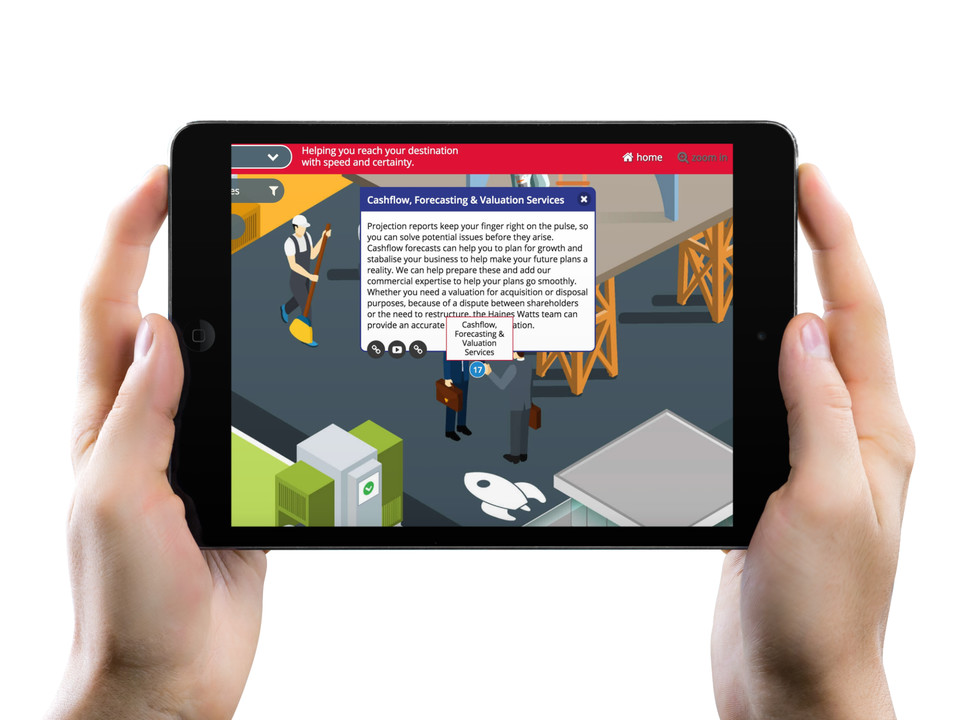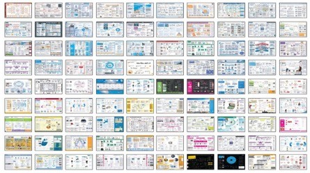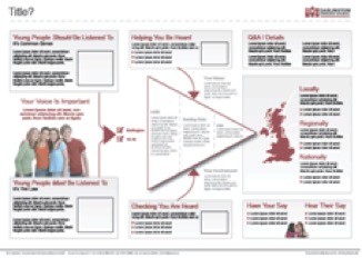
There are two distinct aspects to the design of Klarifi visuals, and visual communications in general:
1) Look and feel
2) Visual organisation (or “information hierarchy”)
Look and feel
This is the personality, the emotion, the branding of a piece – visual tone of voice and body language. You can communicate exactly the same message with the same words in very different ways.
Every message stimulates different emotions and conjures up or lends itself to different themes and styles to effectively communicate each message.

Different projects with very different styles
Often the initial design brief can hinder the impact of the message. For example, one project we carried out for Darlington Youth Service in the North of England – on which we were working on a Klarifi visual aimed at increasing awareness and engagement around a specific Government Youth Initiative. The initial design brief was to stay on brand, but during the feedback with the audience (teenagers) it was obvious that the corporate style brand was diluting the impact of the message. We went back to our design team and asked them to give this Klarifi visual more of a teenage personality, and got the client to agree to go “off brand”… the next feedback group was much more positive – the kids loved the new look, and because of that – they were able to get involved and actually understand the message.


Two variants of the same project with the same content but different look and feel
For a message to be effective, it is important to find a style which is right for your particular audience. We once delivered a project for a large financial organisation. When they were communicating their IT infrastructure changes to all of their group business it became apparent early on that we needed to create two quite different messages. One for the executives and one for the techies. The message for each was relatively similar – but the language and perceived benefits and therefore the style very different. Executives were interested in economies of scale and lowering cost – the “techies” more interested in working smarter and less “red tape”.
Visual organisation (information hierarchy)
For the psychologists among you, here comes the science…
Gestalt principles
The way in which we create Klarifi Visuals and use visuals to communicate, is captured in the Gestalt Principles as applied to visual perception.
Gestalt principles of proximity, closure, symmetry, figure-ground segregation, good continuation, and similarity provide a powerful approach to making instructions more inviting and consistent, as well as easier to access, follow, and understand.
In the 30s and 40s Gestalt psychology was applied to visual perception.
- Law of proximity
- Law of similarity
- Law of Prägnanz
- Law of symmetry
- Law of closure
The following are just some of the Klarifi tools/principles for aiding understanding of a complex message through the use of graphics:
Clear navigation
As with the “top of the jigsaw box”, Klarifi visual stories combine the elements of the story (the “pieces”) with how they “fit together”. Showing this fit, and showing the eye the right way to understand the message, in the right context, is what we call navigation. Some is explicit and obvious like arrows and numbering – but much of it is discreet such as alignment, use of proximity and the other Gestalt principles above. Note: Some of the things you need to do to make the message clear and effective are very different to what a “regular designer” would want to do just make it beautiful. You are effectively choosing to make some areas “jar” visually, to make them stand out and lead the eye down a specific path.
Theming:
Creating a theme, and creating the RIGHT them, can be critical in cascading a message effectively using visual communication. The example below was certainly an “ironic” theme… A humorous theme for an incredibly serious, life and death message. Deliberately so, for maximum impact. This particular audience had been so bombarded with “serious” messages, we had to come from a different angle and in a very direct and strong manner – in order to embed the message.

Perceptions: Colour, texture, hierarchy
Distinguishing between elements on the page, helps the reader to assign priority to them. There are various ways in which our designers use graphics to make these distinctions.
Things like intense/hot colours to show important information, differing textures to distinguish between elements of information. And even very simple things, like giving areas of text a structure that can be understood from a distance.

If you are interested in how you can use Visual Communication and the Klarifi Platform to communicate better in your organisation, drop us a line or check out https://klarifi.co.uk/demos/
